Design Adaptation
Worth a thousand words...
When designing for global or multicultural audiences, it is essential to understand the cultural significance of certain design elements, to avoid misunderstanding or unintentional offense. Always be mindful of local customs, historical associations and cultural taboos, as visual interpretation can change depending on the region, culture and context.
At Branded Translation we assess your campaign creative against the norms, values and associations of your multicultural audience. If adaptation is deemed necessary, we can optimize the creative for you, finding the perfect blend between brand consistency and culturally appropriate design.
To discuss your project or request a quote for our services, please send us an email at info@BrandedTranslations.com.
A few basic examples of culturally relevant design elements:

Imagery
Images that align with the cultural context create a sense of authenticity and understanding, which can foster trust and loyalty, leading to a stronger and relatable connection to the brand. Failing to do so can result in miscommunication and alienation of the target audience.
By thoughtfully selecting culturally appropriate images advertisers can ensure their message is inclusive, respectful and effective, ultimately driving better engagement and results.
Color usage
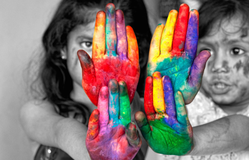
Colors can have a deeper and/or different meaning in other cultures. In China and East Asia, for example, the color red is generally considered an important symbol of prosperity, happiness, and celebration.
On the contrary, in South Africa, red is associated with mourning and can be seen as inappropriate for celebratory events (much like the color white across most Asian cultures).
Needless to say, color usage is an important aspect in multicultural design.
Symbols
While most symbols are universally accepted and understood, there are a few exceptions. And when the meaning of a symbol is different in a particular culture, it is usually a significant one.
For example, in many Middle Eastern countries, the thumbs-up gesture is considered offensive and is used as an insult. When designing for Middle Eastern audiences, consider alternative symbols instead, such as a smiling face or check mark.
The same holds true for the Swastika, a symbol that in Western cultures is associated with Nazi regime. Yet, in Hinduism and Buddhism, it is a symbol of good luck, prosperity and spirituality.
Numbers & Format
Like colors and symbols, some numbers can have specific associations in certain cultures. For example, the number 4 is often considered unlucky in East Asian cultures because its pronunciation is similar to the word for “Death” (“chi” in Chinese and Japanese). This believe is similar to the Western fear of the number 13.
Formats have a more practical concern. One of the most common distinctions is paper size… A4 is the international standard in Europe, Asia, Africa and most of the world, whereas ‘letter size’ is predominantly used in North America. When designing collateral for a global audience, A4 is generally the safer choice.
